Building a Ferrari-inspired morphing dial with Compose Multiplatform
I have a deep appreciation for design that goes beyond function — the kind where you can feel the intention behind every detail. So when Ferrari revealed the Luce infotainment concept, a collaboration with Jony Ive’s design studio LoveFrom, I stopped scrolling. The dashboard they showed wasn’t just beautiful — it was a great example of clean design mixed with delightful animations. One element in particular caught my eye: a single circular dial that morphs fluidly between a clock, a stopwatch, and a compass. Minimal, confident, and obsessively refined.
Good UX, for me, is exactly this: the absence of friction, the presence of intent. Not just that things work, but that they feel right — that every transition is smooth, every proportion deliberate, every detail earned. When I saw that dial I thought: I want to build that. Not to ship a product, but to understand it, to feel through my fingers how much craft goes into something that looks this effortless.
I picked Compose Multiplatform — a framework I know well and genuinely enjoy — and started building.
Disclaimer
This project is strictly for educational purposes and is not affiliated with, associated with, authorized by, endorsed by, or in any way officially connected to Ferrari S.p.A., LoveFrom, or any of their subsidiaries or affiliates. “Ferrari”, the Prancing Horse logo, the “Luce” name, and all related designs are registered trademarks and the exclusive intellectual property of Ferrari S.p.A. This project generates no revenue and exists solely as a technical exploration for the developer community.
What it does
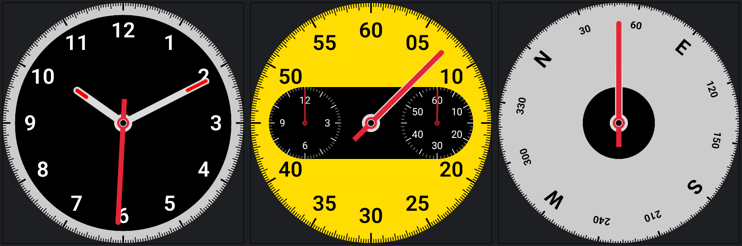
The dial has three modes, each with a distinct visual identity:
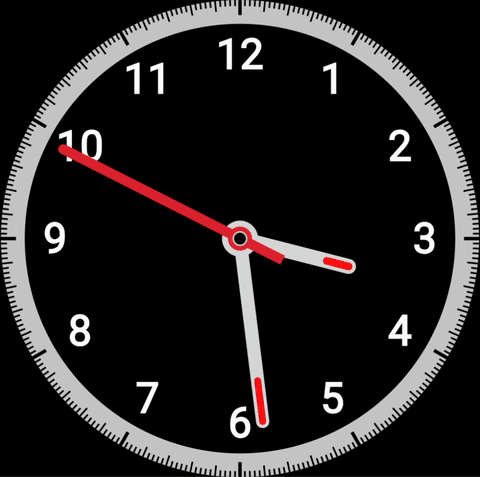
- Clock — a traditional analog face with hour, minute, and second hands against a dark dial
- Stopwatch — a yellow face with two sub-dials for minutes and hours, all clock hands converging on the elapsed seconds position
- Compass — a clean dial with cardinal directions and degree markers that rotate as the device moves
Switching between modes isn’t a jump cut. Everything morphs: the face color, the center shape, the tick mark lengths, the hands — all animate simultaneously. The clock’s pill-shaped center expands sideways into the stopwatch’s sub-dial housing, or collapses into the compass’s clean circle. This choreography was the hardest thing to get right, and the most satisfying once it worked.
The technical side
Drawing the dial: Canvas and polar coordinates
The entire dial is drawn on a Compose Canvas, using nothing but lines, arcs, paths, and text. There are no images or vector assets — everything is procedural.
The core geometry is polar. Each tick mark, hand, and label is placed by converting an angle and a radius into Cartesian coordinates:
val x = center.x + (radius * cos(angleRad)).toFloat()
val y = center.y + (radius * sin(angleRad)).toFloat()
The clock hands are drawn as Path objects — a rectangle with a rounded top (an arcTo semicircle) and an optional tail for the seconds hand. Getting the arc direction right in Compose’s canvas (y-axis points down, so clockwise is positive sweep) took some careful thinking.
Scaling was an interesting challenge. Because the dial needs to look identical at any size and on any display density, I use a single sizeRatio factor derived from the actual canvas pixel width:
sizeRatio = canvasWidth / 1144f // 1144px is the base design size
Every size — tick lengths, stroke widths, hand widths, font sizes — is expressed as a multiple of sizeRatio. The critical detail is that you must not use dp.toPx() for canvas drawing, because toPx() bakes in the display density. On a 2× display, the canvas already has twice the pixels; a dp value that also doubles gives you proportions that are inconsistent across screens. The fix is to work in pure pixel fractions of the canvas size.
For text, the same principle applies to sp: instead of fontSize = 48.sp * sizeRatio (which includes the display DPI factor from sp), I compute the exact canvas-pixel size I want and convert it back to sp by neutralising density and font scale:
fontSize = (48f * sizeRatio / density / fontScale).sp
Compose animations: morphing state
The morphing effect is powered by Compose updateTransition, a declarative API that manages multiple animations in sync. By associating this single transition with several extension methods — such as animateColor for the dial face or animateDp for dimensions and positions — we can define exactly how each property should look for our three states: Clock, Stopwatch, and Compass.
The syntax is remarkably simple: you just define the target value for each state, and Compose takes care of the rest, providing smooth animations with beautifully interpolated values. Because the entire system is tied to the current uiState, switching modes triggers a coordinated choreography where every visual element “knows” where it needs to go:
val transition = updateTransition(targetState = uiState, label = "DialTransition")

val outerBackgroundColor by transition.animateColor(
    transitionSpec = { tween(600) }, label = "FaceColor"
) { state ->
    when (state) {
        is UiState.Clock     -> Color(0xFFCCCCCC)
        is UiState.Stopwatch -> Color(0xFFFFDD00)
        is UiState.Compass   -> Color(0xFFCCCCCC)
    }
}

val primaryTickLength by transition.animateDp(
    transitionSpec = { tween(600) }, label = "TickLength"
) { state ->
    when (state) {
        is UiState.Clock -> 36.dp
        is UiState.Stopwatch -> 48.dp
        is UiState.Compass -> 24.dp
    }
}
For the hand angles I learned something non-obvious: transition.animateFloat is designed for discrete state targets, not for continuously changing values. Using it to track real-time clock seconds caused the hands to animate backward every 60 seconds — the animation saw the angle target jump from ~360° to ~0° and took the shortest path. The fix was to compute hand angles directly from elapsed time each frame (no animation), and use the transition system only for two dimensionless lerp factors:
val nonCompassLerp by transition.animateFloat(...) { state ->
    if (state is UiState.Compass) 0f else 1f
}
val stopwatchLerp by transition.animateFloat(...) { state ->
    if (state is UiState.Stopwatch) 1f else 0f
}
The actual hand angle is then a blend of the frozen clock and frozen stopwatch positions, scaled by these factors:
val secondsHandAngle = (clockSecondsAngle + (swSecondsAngle - clockSecondsAngle) * swRatio) * nonCompassLerp
This also required keeping separate time counters for clock and stopwatch, so each freezes when its mode is inactive. That way, when you switch from stopwatch back to clock, the hands animate from where the stopwatch left them — not from where the clock time happened to jump when the elapsed counter was reset.
Compose Multiplatform: one codebase, four targets
All the rendering logic lives in commonMain. The same Canvas drawing code runs on:
- Android — via Jetpack Compose
- Desktop (JVM) — via Compose for Desktop
- Web (Wasm) — deployed to GitHub Pages via a GitHub Actions workflow
- Web (JS) — fallback for older browsers
The build matrix is simple because Kotlin Multiplatform does the heavy lifting: there’s no per-platform rendering code, no platform-specific sizing logic. The sizeRatio system handles the rest.
A GitHub Actions workflow builds the Wasm distribution on every push to main and deploys it automatically — no manual steps. You can see the live result here:
If your browser doesn’t render iframes, open the live demo here.
Not just an animation — a fully interactive demo
What you see above isn’t a pre-recorded sequence: it’s a live, interactive application built with Compose Multiplatform. You can run it on Android, on Desktop, or right here in the browser — and it behaves exactly the same everywhere.
Use the buttons to switch between modes and try it out:
- The clock displays real system time — the hands move with your actual hours, minutes, and seconds.
- The stopwatch is fully functional: start, pause, and reset it, and watch the elapsed time accumulate precisely.
- The compass is the only simulated part — the ViewModel emits random heading changes every second, mimicking the experience of a car moving through turns in a real driving scenario.
Every transition between these states is smooth and interpolated, thanks to the Compose animation system described above — but the data behind each mode is real (or realistically simulated in case of the compass direction), making this a proper interactive experience rather than a canned demo.
The role of AI
I started building this largely by hand — laying out the geometry, working through the state machine, writing the initial animations. But at several points, having an AI collaborator made a genuine difference.
The angle and path geometry for the dial hands (arc directions, sweep signs, coordinate conversions) involves enough edge cases in Compose’s y-down coordinate system that having a second pair of eyes to reason through the math — and catch when I had the sweep angle backwards — saved real time.
The animation bug — hands rotating backward at the 60-second mark — was subtle. The root cause (using transition.animateFloat as a continuous tracker when it’s designed for discrete targets) wasn’t obvious from looking at the symptom. Talking through the mechanism of how animateFloat computes its from/to values helped me see the fix quickly.
The density scaling bug — inconsistent text and tick proportions across displays (and platforms) — involved understanding the full chain: canvas pixels → sizeRatio → dp.toPx() → the extra density factor. Working through exactly where the density crept in benefited from systematic auditing across the whole drawing codebase.
And across all of it: the iteration loop of “this looks wrong, here’s why I think it is, let’s reason through it” was faster and more precise with an AI that could hold the full context of the problem.
What I learned
Building something beautiful, even in miniature and even as a learning exercise, demands the same rigour that makes real products feel good. The Ferrari Luce dial has maybe ten moving parts visually. Implementing it faithfully involved: polar geometry, animation state machines, density-independent scaling, cross-platform rendering, WebAssembly deployment, and a fair amount of debugging subtle bugs.
Good UX isn’t just about the final frame. It’s about every frame in between.
You can find the project on GitHub. All code is open source under an educational use intent; see the disclaimer above.