
There is a question a lot of people carry around and never say out loud, because saying it out loud feels like an admission: what would I have today, if I had started investing ten years ago?
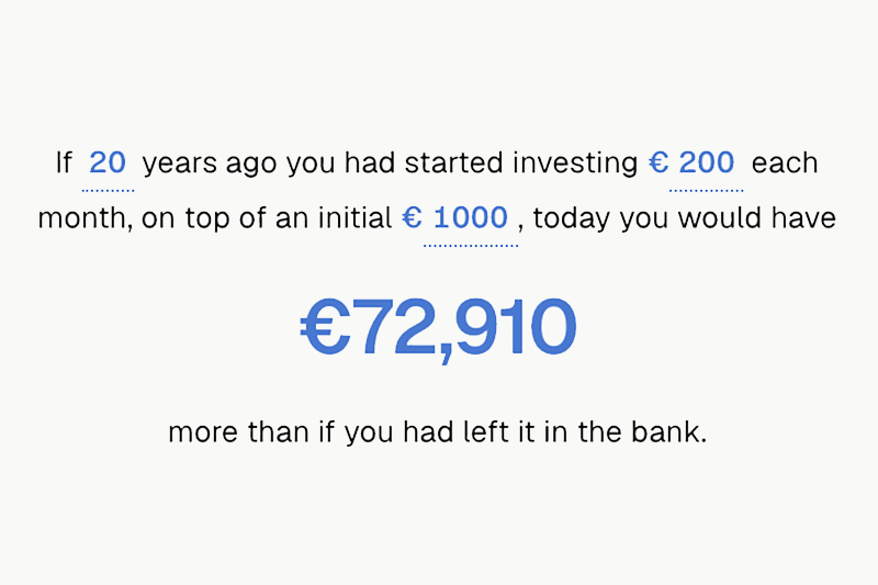
I built whatifiinvested.it to answer exactly that. It is a compound interest calculator, but the headline number is not the one calculators usually show. It is the gap — how far ahead of your bank account you would have ended up.
This post is about why that gap is so hard to picture, what the site does about it, where the numbers stop being trustworthy, and how the whole thing is built with no backend at all.
Personal finance is a blind spot, and in Italy it is a big one
I am Italian, and this is not a comfortable thing to write. The Bank of Italy runs a survey on financial literacy every three years, harmonised with the OECD’s international methodology. In the 2023 edition, Italian adults scored 10.6 out of 20 — up slightly from 10.2 in 2020, and still low. The 2020 survey put Italy below the OECD average outright.
Zoom into the specific concept and it gets sharper. Annamaria Lusardi and Olivia Mitchell’s “Big Three” are three questions on compound interest, inflation and diversification — no arithmetic required, just the concept. In Italy, the compound interest question is answered correctly by about 40% of people, and only a quarter get all three right.
That shows up in behaviour. Consob’s report on the financial investments of Italian households finds low-risk instruments — certificates of deposit, postal savings bonds — in the portfolios of 48% of respondents. And the Bank of Italy’s distributional wealth accounts show that for households in the bottom half of the wealth distribution, more than 90% of assets sit in just two places: the home they live in, and deposits.
Money parked in a current account is not a neutral choice. It is a choice with a cost, and the cost compounds too.
Compound interest does not behave the way your brain expects
Here is the thing nobody tells you: compounding is not slow-then-fast in a gentle way. It is almost nothing, for a long time, and then it is most of the outcome.
Take the site’s own defaults — €1,000 to start, €200 a month, 7% a year, compounded quarterly. These are the actual figures the engine produces:
| Years | Paid in | Ends up as |
|---|---|---|
| 10 | €25,000 | €36,542 |
| 20 | €49,000 | €107,682 |
| 30 | €73,000 | €250,075 |
| 40 | €97,000 | €535,090 |
Look at the 30-year row against the 20-year row. Ten extra years of €200 a month is €24,000 more paid in — and €142,394 more at the end. The growth produced in that last decade alone is larger than the entire balance accumulated over the first twenty years.
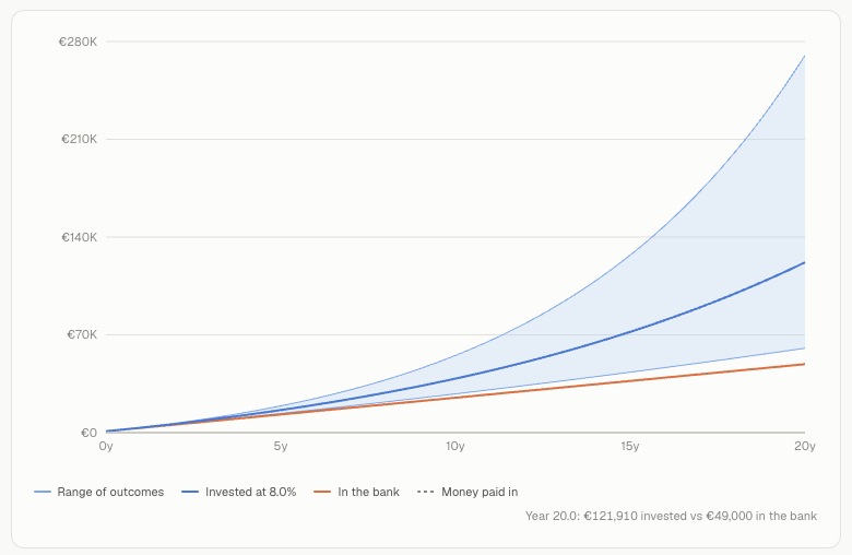
That is the part intuition cannot do. We extrapolate in straight lines, and this is not a straight line. Which is precisely why a chart beats a paragraph — you have to see the curve pull away from the deposits line to believe it.
Two modes, one question
The site has two answers to the same question, because “what if” means two different things depending on who is asking.
Basic mode is the investor.gov-style projection. You set an estimated rate of return and a variance range, and it runs three scenarios — rate + range, rate, rate - range — as a best / average / worst band. Presets (“Global equity ETF”, “S&P 500”, “60/40”) exist only so you don’t have to invent a percentage out of thin air; every number stays editable.
Next to the band sits the same money left in a bank account. The default bank rate is 0%, and that is not cynicism, it is the honest default for a euro-area current account. In July 2026 the ECB put the euro-area rate on household overnight deposits at 0.28%. The site also carries the ECB’s agreed-maturity household deposit series — currently 2.14% — for anyone who actually locks money away. With a 0% bank line, the chart says something blunt: every euro of the gap is compounding you did not get.
Advanced mode is where it gets interesting. You build a portfolio of real funds and shares, pick a start month, and the site backtests those exact holdings against real monthly prices — buy-and-hold with dollar-cost averaging, the initial amount buying units at the start month’s price and every contribution buying more at that month’s price.
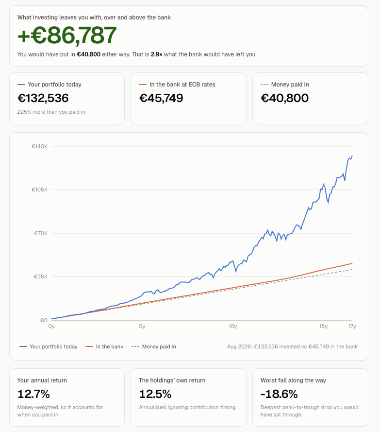
Here is a real run from the published data. iShares Core MSCI World (IWDA.AS), €1,000 initial, €200/month, from January 2010 to August 2026:
- Paid in: €40,800
- Portfolio today: €132,536
- Same money in the bank, at real historical ECB rates: €45,749
- The gap: €86,787
That is not an assumption. That is what those prices did.
What a backtest can and cannot tell you
Backtesting is genuinely powerful. It replaces “roughly 7%, I think?” with “this instrument, these months, this is what happened.” It removes the hand-waving from one half of the problem.
It does not remove it from the other half, and the site says so in several places. The honest list:
- You are picking with hindsight. Choosing an S&P 500 tracker starting in 2006 is a choice available only to someone who already knows how the story went. Nobody in 2006 had that list.
- Past performance does not predict future results. Worth repeating because it is so easy to read a backtest as a forecast in disguise.
- Everything is before tax, inflation, fees, spreads and currency conversion. Any one of those can meaningfully change the outcome; inflation over thirty years changes what the final number means.
- No rebalancing. Weights drift as prices move, and the final drift is reported rather than quietly corrected.
- No FX conversion. Mixing a USD holding into a EUR portfolio is blocked rather than silently adding euros to dollars. Every holding must share one currency.
- Monthly closing prices, from a single free data source, refreshed on a rotation — so the most recent month can be a few days behind.
- The smooth curve is a lie of the medium. Real returns do not arrive in equal instalments. The curve is a good way to see how compounding behaves; it is not what your account balance looks like on the way there.
Basic mode carries its own warning label: the rate of return is a number you chose. The presets are rounded long-run historical averages offered as a starting point, not predictions. A projection is an illustration of a mechanism, not a statement about your future.
About 200 symbols — and a form for the rest
The searchable universe is about 200 hand-picked funds and shares: world and regional UCITS ETFs, bond and commodity ETFs, US-listed ETFs, US large caps, European and Italian blue chips.
That is a curated list, not every ticker on earth, and it is a deliberate trade-off to keep the website running without a backend. The consequence is that sometimes you search for something and it isn’t there. So the portfolio builder carries a “Can’t find what you are looking for? Ask for it to be added” link to a Google Form. With no backend, an off-site form is the only way to hear about a gap — and a missing ticker is a fixable gap, not a limitation. Requests land as an edit to the symbol universe.
The part I have to repeat
Let me quote the site’s own disclaimer, because it is the most important paragraph on it:
This site is for educational purposes only. It does not give financial advice. Nothing here is a recommendation to buy, sell or hold any investment. Every figure is an estimate, worked out from the best data available to us, and will differ from real-world results. Before making any investment decision, speak to someone licensed to advise you in your own country.
Nothing on the site takes account of your circumstances, goals, tax position or tolerance for risk. I am not licensed to advise anyone and I am not trying to. Treat what you see as an illustration of how compounding behaves — not as a statement of what your money did, or will do.
Try it
The site is at whatifiinvested.it, in English and Italian, and the source is on GitHub.
Put in a number you recognise — your actual monthly savings, a date you remember — and look at the gap. That gap is the whole argument. It is also, and this is the genuinely useful part, still available: the best time to see the curve was twenty years ago, and the second best time is while you still have twenty years of it left.